Common UI Mistakes That Hurt Your Website's Performance
At Shaats Pvt. Ltd., we believe great UI (User Interface) design is essential for a website's success. But even the best businesses make small UI mistakes that lead to high bounce rates, lower conversions, and frustrated users.
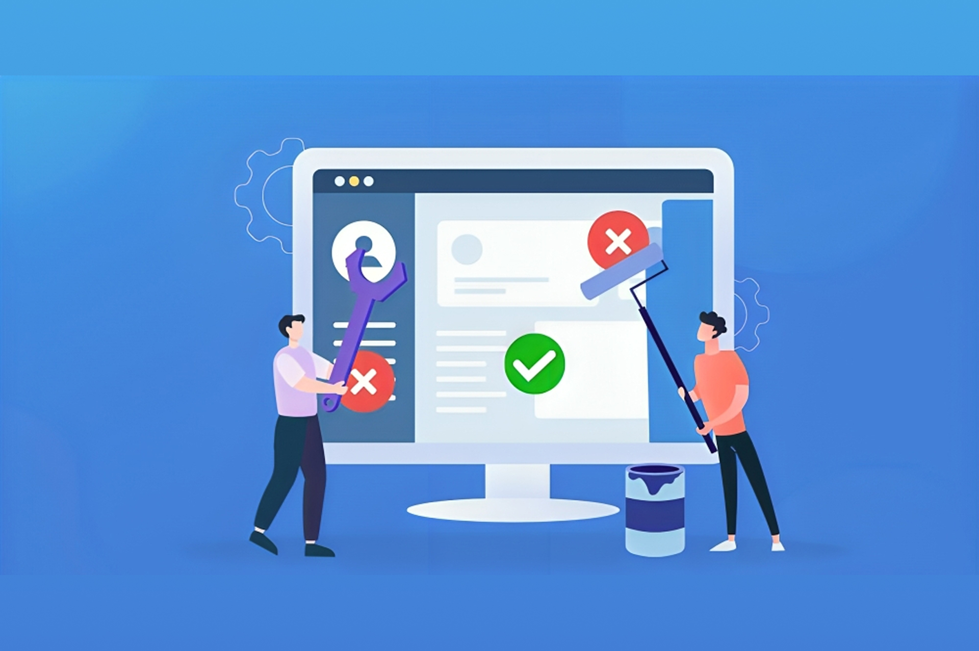
Here's a breakdown of the most common UI mistakes that can seriously damage your website's performance — and how to avoid them.
1. Cluttered Layouts
Problem:
When a page is overloaded with text, images, pop-ups, and calls-to-action, users feel overwhelmed.
Impact:
- Higher bounce rates
- Reduced readability
- Poor focus on key actions
Solution:
- Use white space generously.
- Highlight only the most important content.
- Guide users visually with a clean, balanced layout.
2. Poor Navigation
Problem:
Confusing menus, broken links, or hidden navigation make it hard for users to find what they need.
Impact:
- User frustration
- Higher exit rates
- Lost sales and leads
Solution:
- Keep navigation simple and predictable.
- Make menus easy to access, especially on mobile.
- Use breadcrumbs and search functionality for larger sites.
3. Inconsistent Design Elements
Problem:
Mixing too many colors, fonts, and button styles can make your website look unprofessional.
Impact:
- Weakens brand identity
- Causes cognitive overload
- Reduces user trust
Solution:
- Create a design system with defined fonts, colors, and UI elements.
- Maintain consistency across all pages and interactions.
4. Slow Loading Pages
Problem:
Heavy images, videos, unoptimized code, and too many third-party scripts can slow your website down.
Impact:
- Increases bounce rates (especially on mobile)
- Hurts SEO rankings
- Decreases user satisfaction
Solution:
- Optimize images and files.
- Use lazy loading.
- Choose a reliable hosting service.
- Minimize unnecessary scripts and plugins.
5. Weak Call-to-Actions (CTAs)
Problem:
If users don't know what to do next, they simply leave.
Impact:
- Fewer conversions
- Missed sales opportunities
Solution:
- Create clear, compelling CTAs.
- Use action words like Get Started, Book a Demo, Download Now.
- Place CTAs strategically across the website.
6. Ignoring Mobile Users
Problem:
A website that isn't optimized for mobile leads to a terrible user experience.
Impact:
- Loss of over 50% of potential visitors
- Lower Google rankings
- Frustrated mobile users
Solution:
- Use responsive design.
- Test your site on different devices and screen sizes.
- Prioritize mobile loading speed and user flow.
7. Overcomplicated Forms
Problem:
Asking for too much information at once can scare users away.
Impact:
- Form abandonment
- Fewer leads captured
Solution:
- Keep forms short and simple.
- Ask only for essential information.
- Use smart forms that expand as needed.
8. Bad Visual Hierarchy
Problem:
If users can't quickly tell what's important on a page, they get confused.
Impact:
- Missed key messages
- Reduced engagement
Solution:
- Use size, color, and placement to guide attention.
- Highlight primary actions and headlines.
- Organize information in a logical flow.
Final Thoughts
Avoiding these common UI mistakes is critical for your website's success in 2025 and beyond. A website that is clear, consistent, fast, and mobile-friendly will keep users engaged—and drive real business results.
At Shaats Pvt. Ltd., we specialize in creating high-performing, user-centric websites that deliver exceptional experiences.
We're here for you.
We are fully qualified specialists with the expertise you require.